I like to joke with my family, kids, wife, friends and even clients when they go off into something… well weird… and I ask them, “What IS the color IN the sky in your world?”. I deal with color every day and it can be one of the most frustrating things to explain to clients who don’t have the background. Colors are in the eye of the beholder. I am not speaking metaphysically but literally. What you see is not necessarily what I see. Let me explain.
If I am sending a proof for a printing job, whether a brochure, flyer, business card, label or tag and it is in color, every proof will look different to everyone.
- It will be different on every computer screen, even if they are the same model. All screens have variances and usually have different color settings;
- If you print it, the same goes for color printers, add the fact that one of the ink colors may be running low;
- Perception IS in the eye of the beholder and colors can look different to different people;
- Last…what you think is a great color for the job may not be what the client envisions.
How can you eliminate this issue? You can’t… but you can mitigate it by:
- Educate your client (gently) that there are differences (as outlined above);
- Educate them about colors on different substrates (e.g. Coated vs. Uncoated Stock);
- Advise them that other substrates (e.g. Kraft label paper) WILL affect the true color;
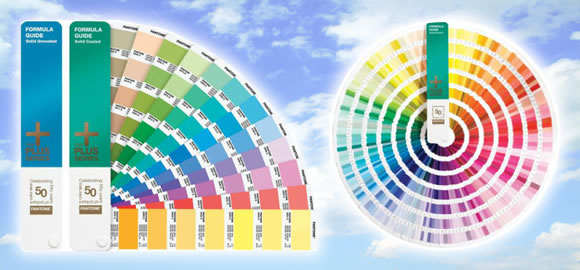
- Show them PMS Color Chips (if it’s spot color) to show as close to true color as possible;
- Let them know PMS colors (even on repeats) can vary between jobs due to mixing the inks;
- Processes matter also. Digital, CMYK Offset, PMS Spot all produce color variances.
Bottom line… as a print or as a customer… understand that everyone’s “sky”… can be different.


